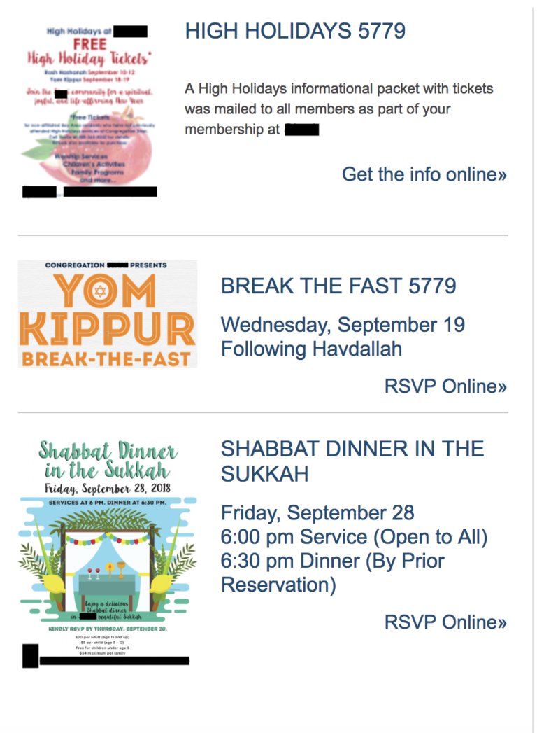
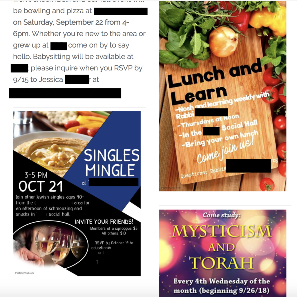
You go to your synagogue’s website and prominently featured on the homepage are little shrinky-dink versions of paper flyers. Reduced from their original 8.5 by 11′ inch size, these thumbnails are everywhere. They are announcing upcoming events, reminding you to register your children for religious school, and so on.
In their original printed form, these flyers were perfect. Bright text artfully positioned on top of engaging images that grab your congregants attention. But, when the same flyers are added to your homepage problems abound.

Minimizing the document’s size results in text that is hard to read. Fine details like the event time and location are lost to the constraints of the now too small font. Sure you can click on the thumbnail to view the full-sized version, but first impressions matter.
Tiny flyers just don’t have the same ‘curb appeal’ as they do when they are printed and displayed in their normal size.
Pics used on a flyer may be rectangular in nature. It’s easy for these images to lose their clarity when the flyer is reduced in size to fit into the desired space on the homepage.
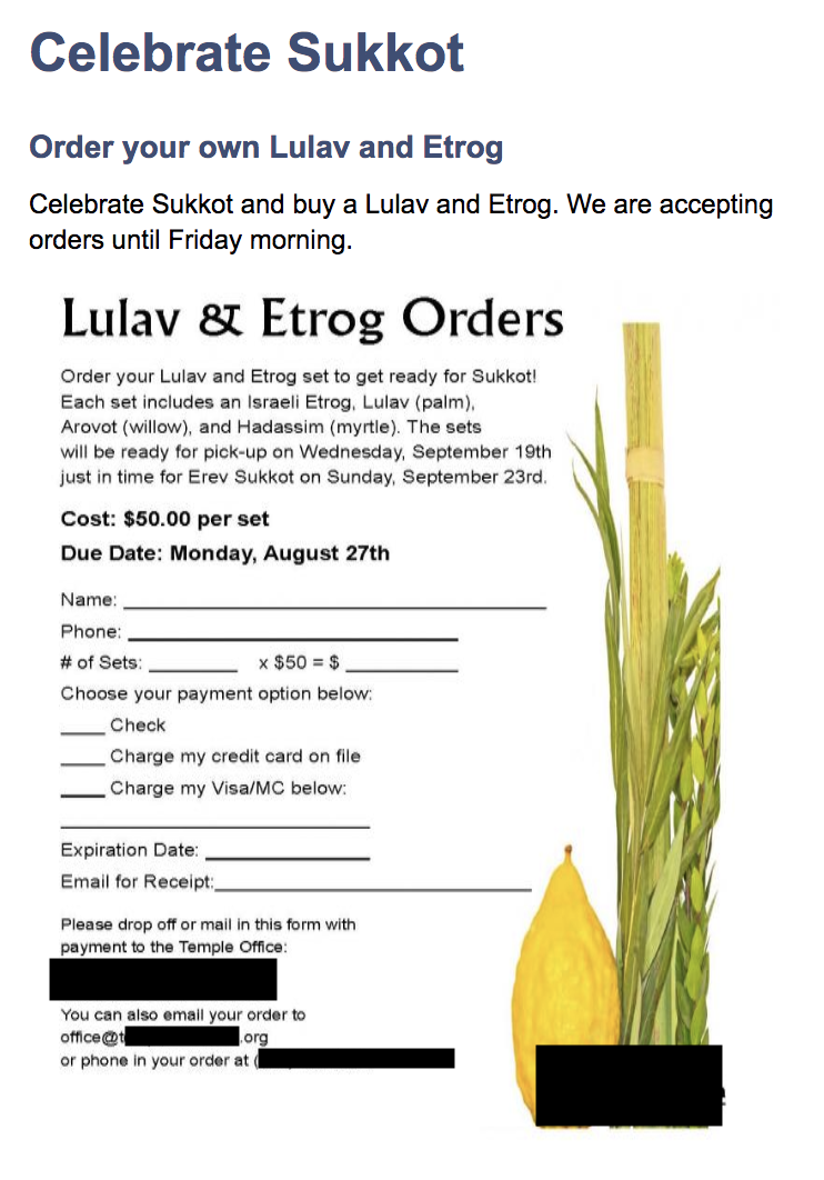
Flyers are designed for people to take home and hang up on their fridge. Printed forms are meant to be filled out by hand and dropped in the mail. The email address directing you to contact the event organizer to RSVP is only helpful when you have the flyer next to you as you send an email from your computer or phone. It’s frustrating to see an email address on a website that doesn’t allow you to automatically send an email.
The URL redirecting you to register online also doesn’t work. The links are not active. Sometimes and somewhat comically the synagogue’s URL even appears directing you go visit the website for more info, which seems a bit redundant as you are already on their synagogue’s website….

Your website is your best communication and marketing tool. It’s the public face of your synagogue and you want it to look good. By using consistent fonts and colors throughout the website, it gives your site a professional feel. And when you extend the design aesthetic of your website to all marketing materials, including emails and printed flyers, it further reinforces your brand. The end result is a tailored and polished look – a worthy goal for all synagogues.
However, many synagogues who add flyers to their homepages often end up with a messy and disjointed feel. This is because flyers are often designed around the nature of the event and not the synagogue’s branding. Big mistake. Just because you are having a luau themed Shabbat dinner doesn’t mean that you should abandon your branding in favor of bright pinks and flashy yellows. Always try to stay on brand – no matter the event.

The web is a visual world and it’s also one where users are able to interact with their surroundings. This technology invites people to do things – take action- and not just passively digest information – like they do when reading a flyer.
Many of your congregants have come to expect a level of convenience by submitting info via the website instead of mailing in a printed document. Some congregants may print out the full-size version flyer, but we are willing to bet that the submissions will come in faster and in greater abundance when you invite congregants to register online.
Search engines like Google can’t scan an image and tease out the individual words and phrases. Your flyers are bursting with keywords that are fantastic for SEO (search engine optimization). Keywords like your synagogue’s name, address, religious school, or early childhood programs are lost. It’s a missed opportunity and one that’s easy to correct by adding those words directly to your site instead of relying on the image.
Websites are a radically different medium than print. What works beautifully in print fails to properly translate to an online environment. Aesthetic challenges like itsy-bitsy font and stretched images impact the clarity and appearance of a once stylish flyer.
Posting event flyers as images on a synagogue’s website is an outdated practice. It’s one that tends to do more harm than good. In the short run, you may save time by posting a thumbnail version of an event flyer, but the convenience is not worth the price.
We are here to answer any questions you may have about Addicott Web, our services, or how we help synagogues thrive online.
"*" indicates required fields