
Most synagogues have had a website for years. The harder question is whether that website is still doing what you need it to do.
A synagogue website has a lot of jobs. It introduces prospective members to your congregation. It helps current members find service times, upcoming programs and other important information. It tells the story of your community — who you are, what you value and what makes your synagogue distinctive.
And sometimes, a website that worked perfectly well five or ten years ago simply doesn’t reflect the congregation anymore.
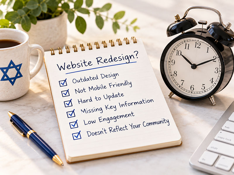
So how do you know when it’s time for a redesign? Here are six signs worth paying attention to.
1. Your Website No Longer Feels Like Your Synagogue
This may be the biggest sign of all.
Your congregation may have changed significantly since your website was last designed. You may have new clergy or leadership, different programming, new priorities or a clearer understanding of who you are as a community.
But does your website reflect that?
Someone visiting your synagogue for the first time may visit your website before ever walking through your doors. What they see online should give them an authentic sense of the community they’ll encounter when they arrive.
If your website feels dated, impersonal or simply disconnected from who your congregation is today, it may be time to rethink it.
2. It’s Hard for People to Find the Information They Need
A beautiful website isn’t particularly helpful if visitors can’t find anything.
Think about some of the most common reasons people come to your website:
When are Shabbat services? What’s happening this weekend? How do I register for a program? Where can I find information about religious school? How do I make a donation? I’m new — where should I start?
The answers shouldn’t require hunting through multiple menus and pages.
Over time, synagogue websites tend to accumulate content. New pages are added, old pages remain in place and navigation structures become increasingly complicated. A redesign provides an opportunity not only to change how the website looks, but to reconsider how all of that information is organized.
Good synagogue website design should make the important things easy to find.
3. Making Updates Has Become a Chore
Your website should make life easier for your staff and volunteers — not create another headache.
If changing a service time, adding a new page, updating a staff member or promoting an upcoming program requires calling a developer every time, something isn’t working as well as it should.
The same is true if only one person knows how to update the website and everyone else is afraid to touch it.
A modern synagogue website should provide a manageable system for routine updates while still allowing for more sophisticated design and functionality when needed.
Your staff has enough to do. Updating the website shouldn’t be one of the hardest parts of the week.
4. The Website Has Grown Piecemeal Over the Years
Sometimes there isn’t anything obviously wrong with a synagogue website. It has simply been added to and modified so many times that it no longer feels cohesive.
A new section gets added here. A registration button gets squeezed in there. Different people create pages over the years. Some pages use one layout while others use something completely different.
Eventually, the website starts to feel less like one intentional experience and more like a collection of additions.
That’s normal. Websites evolve along with congregations.
But at a certain point, another round of patches isn’t the answer. A redesign gives you the chance to look at the entire website again — its structure, content, design and priorities — and build something cohesive around the congregation you are today.
5. It Doesn’t Work as Well on a Phone as It Does on a Computer
Having a “responsive” website is no longer enough. Nearly every modern website technically adapts to smaller screens.
The better question is: Is it actually easy to use on a phone?
Can someone quickly find tonight’s service time? Can they read the calendar without pinching and zooming? Can they register for an event or make a donation without struggling through a complicated form? Is the navigation simple and understandable?
For many visitors, the mobile version of your website isn’t a secondary version. It’s the website.
Your synagogue’s most important information should be just as accessible from a phone in the parking lot as it is from a desktop computer at home.
6. You Find Yourself Apologizing for Your Website
This is a surprisingly good test.
Maybe someone asks about your synagogue and you say, “Take a look at our website — although it’s pretty outdated.”
Or perhaps a prospective member tells you they found you online, and your first thought is that you wish they had seen something better.
Your website doesn’t have to be flashy, trendy or filled with elaborate effects. But you should feel comfortable sending people there.
It should represent your congregation in a way that feels authentic, welcoming and current.
If you’re regularly explaining away your website’s shortcomings, that’s probably telling you something.
A Redesign Is About More Than a New Look
Redesigning a synagogue website isn’t simply about making it prettier.
It’s an opportunity to step back and ask some bigger questions.
Who is using the website? What are they coming there to find? What do prospective members need to understand about your congregation? What information do current members need most often? What content is no longer necessary? And what makes your synagogue different from the congregation down the street?
Those questions should shape the website long before decisions are made about colors, fonts or photographs.
The goal isn’t simply to build a newer website.
It’s to build a website that better reflects your synagogue, better serves your community and makes it easier for someone who doesn’t know you yet to understand what makes your congregation a place they might want to call home.