
Before someone reads the welcome message on your synagogue website, explores your programs or learns anything about your congregation, they’ve already formed an impression.
Color is one of the reasons why.
A website filled with bright, saturated colors feels very different from one built around soft, muted tones.
Deep navy, charcoal and burgundy create a different atmosphere from sky blue, sage and cream.
Neither approach is inherently better.
The question is:
What impression should your synagogue website make — and do the colors help create it?
Color Communicates Personality
Imagine the same synagogue website designed three different ways.
The first uses bright blue, orange, green and yellow.
It may feel energetic, lively, youthful and active.
The second uses pale blue, sage green, warm beige and other muted tones.
It may feel calm, welcoming, gentle and contemporary.
The third uses deep navy, burgundy, charcoal and gold.
It may feel established, sophisticated, traditional and substantial.
The words could be exactly the same.
The photographs could be exactly the same.
But you’d experience the congregation differently.
That’s the power of color.
Color doesn’t simply decorate a website.
It helps establish its personality.
Bright Colors Can Create Energy
Bright colors can work beautifully for a synagogue that wants to convey energy, activity and warmth.
They can be particularly effective when a congregation has a strong emphasis on families, children, community events and an active calendar.
But there’s a difference between colorful and chaotic.
If every section is a different bright color, every button competes for attention and every accent is equally strong, the website can quickly become overwhelming.
Bright colors generally work best when there’s a system behind them.
Perhaps one or two strong colors do most of the work while additional colors are used more selectively.
White or neutral space can give those brighter colors room to breathe.
The goal isn’t necessarily to use less color.
It’s to give the color some discipline.
Pale and Muted Colors Can Feel Warm and Welcoming
Softer colors create an entirely different mood.
Sage green.
Dusty blue.
Muted gold.
Warm cream.
Soft terracotta.
These kinds of palettes can feel contemporary without being cold and welcoming without being overly playful.
They’re especially useful when the photography provides much of the visual energy.
Instead of competing with photographs of congregants, the colors can create a quieter framework around them.
But pale doesn’t have to mean washed out.
A website built entirely from very light colors can lose visual hierarchy. Buttons don’t stand out. Sections blend together. Important information becomes harder to identify.
That’s why even a soft palette usually benefits from one or two deeper colors to provide contrast and emphasis.
Dark Colors Can Create Depth and Sophistication
Dark colors are sometimes underused on synagogue websites.
Deep navy, forest green, burgundy, plum and charcoal can create a rich, sophisticated look.
They can work particularly well as backgrounds for selected sections, headers, footers or calls-to-action.
Paired with strong photography and lighter typography, a dark section can create a dramatic visual moment.
But again, balance matters.
A website dominated by dark colors may feel heavier or more formal than the congregation intends.
If your synagogue describes itself as casual, joyful and approachable, an overwhelmingly dark palette may send a different message.
That doesn’t mean you can’t use dark colors.
It means they should support the personality you’re trying to convey.
Start With the Synagogue’s Existing Brand
When I begin designing a synagogue website, one of the first things I look at is the congregation’s existing visual identity.
Is there a branding guide?
Are there established colors?
Does the logo specify particular color values?
Are those colors being used consistently elsewhere?
If the synagogue already has a thoughtful visual identity, the website shouldn’t reinvent it.
The website is one part of the larger synagogue brand.
Someone who sees a synagogue email, printed brochure, social media graphic and website should feel that they all came from the same organization.
A formal branding guide makes that easier.
But many synagogues don’t have one.
That’s okay.
The Logo Is Often the Starting Point
Even without a branding guide, the logo can provide clues.
Suppose the synagogue logo uses navy blue and gold.
Those colors become an obvious starting point.
But that doesn’t mean the entire website needs to consist of navy blue and gold.
A two-color logo isn’t necessarily a complete website palette.
I might keep the navy as a primary color, use the gold more selectively as an accent, and introduce complementary colors that give the website greater flexibility.
Perhaps a softer blue.
A warm neutral.
A muted green.
A light background tone.
The goal is to build outward from the existing identity, not simply repeat the logo colors everywhere.
Sometimes the Logo Colors Aren’t Enough
Occasionally a logo gives me very little to work with.
Perhaps it’s entirely blue.
That’s not uncommon for Jewish organizations.
Blue has obvious associations with Jewish identity, and there’s nothing wrong with using it.
But a website where every heading, button, background and icon is a slightly different shade of blue can become monotonous.
That’s where a broader palette helps.
What complements the blue?
Should the overall feeling be warm or cool?
Would a muted gold provide contrast?
Could a soft green add warmth?
Would a neutral beige make the photography feel more inviting?
The logo provides an anchor.
The website palette provides the vocabulary around it.
And Sometimes I Get to Start From Scratch
Some of my favorite projects begin with:
“We don’t really have colors.”
Perhaps the synagogue has an older logo that’s being replaced.
Maybe there has never been a formal visual identity.
Or the congregation simply doesn’t have an established palette beyond a color someone chose years ago for reasons nobody remembers.
In those cases, I can build a palette specifically for the new website.
And I don’t begin by asking:
What’s my favorite color?
I begin with the congregation.
What does this community feel like?
Is it traditional or contemporary?
Formal or casual?
Large and bustling or small and intimate?
Is the website trying to convey energy?
Warmth?
Joy?
History?
Spirituality?
Intellectual engagement?
Family?
Community?
The answers influence the colors I explore.
Photography Can Help Determine the Palette
Sometimes the congregation itself provides the inspiration.
A beautiful sanctuary may contain warm wood tones, stained glass, deep blues or distinctive architectural details.
A collection of strong community photography may have a particular warmth to it.
Perhaps there’s a recurring color in the building, artwork or ritual objects that feels uniquely connected to the congregation.
Those visual cues can influence the website palette.
That doesn’t mean matching the website to the carpet in the social hall.
It means looking for colors that feel naturally connected to the congregation’s existing visual world.
You Need More Than a Collection of Colors
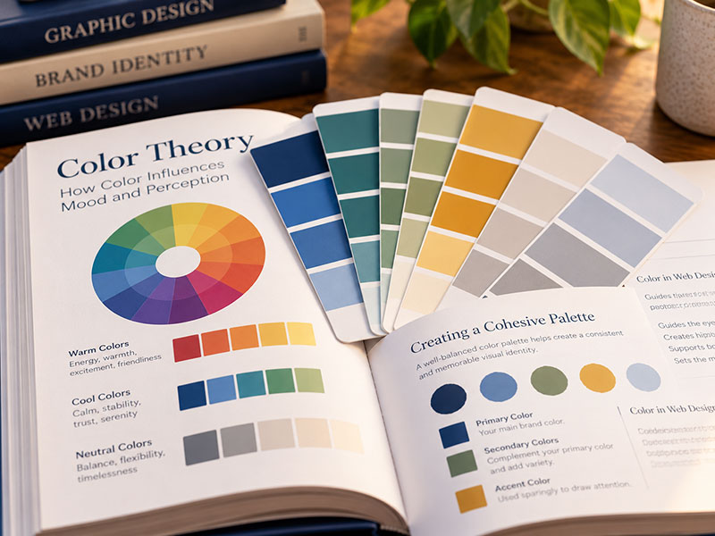
A color palette isn’t simply five attractive squares sitting next to one another.
Each color needs a job.
I might establish:
- A primary color – The color most closely associated with the synagogue’s visual identity.
- A secondary color – A complementary color that provides variety.
- An accent color – Used selectively for buttons, links or elements that deserve attention.
- Light neutrals – Used for backgrounds and quieter sections.
- Dark neutrals – Used for text, navigation or stronger visual contrast.
There may be additional colors depending on the design.
What’s important is that they’re used consistently.
If the same shade of gold means “important action” in one place and is merely decorative everywhere else, its visual meaning becomes weaker.
Consistency helps visitors understand the design without consciously thinking about it.
Color Helps Establish Hierarchy
One of color’s most practical jobs is telling people where to look.
Imagine a page where everything is navy blue.
The heading is navy.
The icons are navy.
The links are navy.
The button is navy.
Nothing stands out because everything stands out equally.
Now imagine that the page is primarily neutral, with navy used for headings and a warm gold reserved for the most important call-to-action.
Your eye knows where to go.
That’s visual hierarchy.
Color can separate sections, identify clickable elements, emphasize important information and guide visitors through a page.
Good color choices aren’t only about appearance.
They make the website easier to use.
Your Call-to-Action Color Should Actually Call Attention
This is one place where I often deliberately reserve a color.
If Join Us, Register, Donate, Learn More and other important buttons use a distinctive accent color, visitors begin to recognize that color as something actionable.
That color shouldn’t necessarily appear on every decorative element on the page.
If everything is an accent, nothing is an accent.
Sometimes the most effective use of a beautiful color is using less of it.
Contrast Matters
There is also a practical limit to what looks attractive.
Text needs to be readable.
A pale gray sentence on a white background may look elegant on a designer’s monitor and be miserable to read for someone with reduced vision.
Likewise, white text over a light photograph can disappear.
Buttons need enough contrast from their backgrounds.
Links need to be identifiable.
Color choices should take accessibility into account from the beginning, not after the website has already been designed.
Sometimes that means adjusting a brand color slightly for certain uses.
The goal isn’t simply to preserve an exact color value everywhere.
The goal is to use the brand effectively and make the website usable.
Different Sections Can Have Different Moods Without Becoming Different Websites
A synagogue contains many experiences.
Worship may feel contemplative.
Preschool may feel playful.
Adult learning may feel thoughtful.
Social action may feel energetic.
A website can reflect some of those differences without giving every department its own unrelated color scheme.
The core palette provides consistency.
Then certain colors can receive greater emphasis in different contexts.
The preschool section might make greater use of brighter secondary colors.
A worship section might lean into deeper tones and photography.
The visual mood can shift while the overall identity remains intact.
Color Should Support the Photography, Not Fight It
Photography and color have to live together.
If your website uses strong photographs of real congregants — which I almost always encourage — the palette needs to give those images room to work.
A photograph already contains dozens or hundreds of colors.
Put it next to a highly saturated background, several colorful icons and a bright button and the page can become visually exhausting.
Often, quieter colors surrounding a photograph make the photograph feel stronger.
Other times, pulling a color from the photograph into a nearby section creates a beautiful connection.
Color shouldn’t be designed in isolation.
It’s part of the complete visual system.
Don’t Choose Colors Just Because They’re Trendy
Website design trends change.
At one point everyone seems to be using muted earth tones.
Then everything becomes bright and saturated.
Then dark backgrounds become popular.
Then gradients return.
There’s nothing wrong with being influenced by contemporary design.
A website should feel current.
But a synagogue’s visual identity should have a longer lifespan than the latest design trend.
Ask whether the palette feels appropriate for this congregation, not simply whether it resembles other websites being designed this year.
There’s No Universal “Synagogue Color Palette”
Jewish blue is wonderful.
So is a website with no blue whatsoever.
A synagogue website doesn’t need a Star of David in the logo, blue buttons and gold accents in order to look Jewish.
Jewish identity comes through in many ways — photography, language, content, ritual objects, architecture and, most importantly, the people and experiences represented on the site.
Color should communicate the individual congregation’s personality.
A vibrant urban congregation may call for one palette.
A historic traditional congregation may call for another.
A warm, family-oriented suburban congregation may suggest something entirely different.
That’s one of the reasons I don’t begin synagogue website projects with a predetermined visual formula.
What Should Your Colors Say About You?
When someone visits your synagogue website, they’re absorbing more than information.
They’re getting a feeling.
This place feels warm.
This community feels energetic.
This congregation feels thoughtful.
This feels like a place with history.
This feels contemporary.
This feels welcoming.
The photographs contribute to that impression.
The typography contributes to it.
The words certainly contribute to it.
And color is working alongside all of them.
If your synagogue already has a strong visual identity, the website should build upon it.
If you have a logo but no complete palette, that logo can provide the starting point.
And if you don’t have established colors at all, that’s not a problem.
It’s an opportunity to create a palette intentionally around the personality of the congregation.
Because the question isn’t simply:
“Which colors look good together?”
It’s:
“What should someone feel when they see them?”