
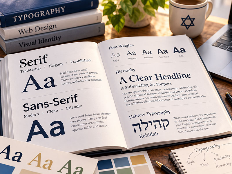
Change the font and you can change the entire personality of a website.
The words haven’t changed.
The photographs haven’t changed.
The colors haven’t changed.
But somehow, the congregation feels different.
Typography is one of those parts of website design that most visitors don’t consciously notice when it’s working well. They’re unlikely to leave a synagogue website thinking:
“That was an excellent font pairing.”
But they absolutely experience the effect.
A typeface can make a synagogue feel traditional or contemporary. Formal or casual. Warm or institutional. Sophisticated or playful.
And beyond personality, typography has an even more important job:
People need to be able to read it.
That’s why choosing fonts for a synagogue website involves much more than finding something that looks attractive.
Fonts Have Personalities
Imagine the same homepage headline:
Welcome to Our Community
Now picture it in an elegant, traditional serif typeface.
It might feel established, thoughtful or sophisticated.
Put those exact words in a clean, geometric sans-serif.
Suddenly, they may feel contemporary, simple and confident.
Try a softer, more rounded sans-serif and the message may feel friendlier and more casual.
The words are identical.
The impression isn’t.
Typography creates an emotional tone before someone has consciously thought about why.
That’s one of the reasons I spend time choosing fonts early in the design process.
Serif vs. Sans-Serif
The most basic distinction you’ll encounter is between serif and sans-serif typefaces.
Serif fonts have small strokes or details at the ends of their letterforms. They’ve traditionally been associated with books, newspapers and other printed material.
Because of that history, serif fonts can convey qualities such as:
Tradition. Authority. History. Elegance. Scholarship.
Sans-serif fonts don’t have those additional strokes. They tend to have cleaner, simpler letterforms and are strongly associated with modern graphic and digital design.
Depending on the particular typeface, they can feel:
Contemporary. Clean. Friendly. Direct. Minimal.
But these aren’t rules.
There are modern serifs and traditional-looking sans-serifs.
Some serif fonts feel warm and approachable. Others feel formal and imposing.
Some sans-serif fonts feel playful. Others feel corporate.
The category gives you a starting point.
The individual typeface provides the personality.
Mixing Serif and Sans-Serif Fonts
One approach I frequently use is pairing two different typefaces.
For example, I might use a serif font for headings and a sans-serif for body copy.
The serif gives the large headlines personality and distinction, while the sans-serif provides clean, comfortable reading for longer passages.
That combination can work particularly well for a synagogue.
There’s something appropriate about balancing a sense of tradition with a contemporary digital experience.
But I sometimes reverse the combination.
A strong sans-serif heading can feel modern and confident, while a highly readable serif used for body text can create warmth and character.
Neither approach is inherently better.
It depends on the congregation and the fonts themselves.
Two Fonts Should Have a Reason to Be Together
Choosing two attractive fonts doesn’t necessarily mean they’ll make an attractive pair.
They need to complement one another.
Sometimes contrast is what makes the pairing work.
A distinctive serif heading paired with a restrained sans-serif body font gives each typeface a clear role.
What I generally don’t want is two fonts that are almost the same.
If they look similar but not quite identical, the difference can feel accidental.
It’s a little like wearing two slightly different shades of black.
Either create enough contrast for the distinction to feel intentional or use one typeface consistently.
Sometimes One Font Is All You Need
A website doesn’t need multiple fonts to have visual variety.
Sometimes I use a single typeface throughout the entire website.
When I do, it’s often a versatile sans-serif family with multiple weights.
The headings might be bold.
Subheadings might be semibold.
Body copy might be regular.
Small labels or navigation might use medium.
The typeface stays consistent, but its weight, size and spacing create hierarchy.
That can produce a particularly clean and contemporary design.
It also demonstrates an important principle:
Typography isn’t only about which font you choose. It’s about how you use it.
Font Weight Helps Create Hierarchy
Look at almost any well-designed webpage and you’ll know where to look first.
That’s hierarchy.
The main heading might be large and bold.
The introductory paragraph may be slightly larger than the regular body text.
Section headings clearly separate ideas.
Smaller supporting information recedes visually.
Buttons stand out.
You don’t consciously need to think:
This is the most important text. This is secondary. This is supporting information.
The typography tells you.
Font weight is one of the tools I use to create that hierarchy.
But bold isn’t automatically better.
If everything is bold, nothing feels particularly important.
Just like color, typography works through contrast.
Size Matters
A beautiful font isn’t useful if people struggle to read it.
Website body copy should be comfortably sized.
That sounds obvious, but websites have historically had a tendency to make text smaller than it needs to be in the name of looking sophisticated or fitting more content onto the screen.
There’s no prize for squeezing an extra paragraph above the fold.
People should be able to read your website comfortably without zooming.
And remember who may be using a synagogue website.
Your audience can span generations.
A twenty-five-year-old parent looking at preschool information and an eighty-year-old congregant looking for service times are using the same website.
Typography needs to work for both.
Bigger Isn’t Always Better, Either
The opposite trend exists, too.
Modern websites sometimes use enormous headings that consume most of the screen.
That can create dramatic visual impact.
Used selectively, it can be beautiful.
But typography still needs to serve the content.
A headline shouldn’t become so large that a short phrase wraps awkwardly across five lines on a laptop.
A mobile visitor shouldn’t have to scroll through a screen and a half of headline before reaching the information.
Good typography adapts.
The appropriate size depends on the typeface, the words, the screen and the role the text plays.
Readability Comes Before Personality
I might love the personality of a particular typeface.
That doesn’t mean I’m going to use it for three paragraphs of body copy.
Highly stylized fonts can work beautifully for large headings where there are only a few words.
Use that same font for a long page of membership information and it may become exhausting.
Body fonts have a different job.
They need to disappear a little.
The visitor shouldn’t be thinking about the letterforms.
They should simply be reading.
That’s why I tend to use fonts designed for good readability for longer passages and reserve more distinctive typography for places where personality matters most.
Line Length and Spacing Matter, Too
Readability isn’t determined by font choice alone.
How wide is the paragraph?
How much space is there between lines?
How much space separates one paragraph from the next?
A paragraph stretching nearly the full width of a large desktop monitor can be difficult to follow because your eyes have to travel too far from the end of one line to the beginning of the next.
Make the column too narrow and the reader is constantly jumping to another line.
Likewise, lines packed too tightly together can feel dense and intimidating.
Good typography gives words room to breathe.
That’s why I think about the text container, line height and spacing alongside the typeface itself.
They’re all part of the same reading experience.
Don’t Forget Mobile Typography
Typography that works beautifully on a desktop screen may need to change on a phone.
Large headings generally need to scale down.
Spacing may need adjustment.
Line lengths naturally become shorter.
Navigation changes.
Buttons need readable labels without becoming enormous.
This is another reason typography should be treated as a system rather than a collection of fixed font sizes.
The hierarchy should remain consistent across devices even when the actual measurements change.
The main heading should still feel like the main heading.
It just shouldn’t occupy the entire phone.
Accessibility Is Part of Typography
Readable typography isn’t simply a design preference.
It’s an accessibility issue.
Font size matters.
Contrast matters.
Line spacing matters.
Clear hierarchy matters.
The typeface itself matters.
Very thin font weights can become difficult to read, particularly at smaller sizes or with insufficient contrast.
All-uppercase text can work well for a short label or navigation item but becomes tiring in longer passages.
Long blocks of centered text are harder to read than left-aligned paragraphs.
Typography should make content easier to access, not create another obstacle.
Where Do the Fonts Come From?
For the synagogue websites I design, I primarily work with professional web fonts from two sources.
Google Fonts provides a large collection of typefaces specifically designed and licensed for use on the web.
I also use Adobe Fonts, which gives me access to an even broader library of professional typefaces through my Adobe licensing.
Having those libraries available means I’m not limited to the small collection of fonts that happen to come installed on someone’s computer.
I can choose typography specifically for the congregation and the design.
And because these are proper web fonts, visitors don’t need to have the font installed on their own devices in order to see the website as intended.
I Don’t Start With a Favorite Font
Just as I don’t begin every synagogue website with the same color palette, I don’t begin with a predetermined pair of fonts.
I look at the congregation.
What does the synagogue feel like?
Is it traditional?
Contemporary?
Warm?
Sophisticated?
Casual?
Energetic?
Intellectual?
Family-oriented?
What does the logo look like?
What colors are we using?
What kind of photography will appear throughout the site?
Typography has to work with all of those things.
A typeface that looks beautiful on one synagogue website might feel completely wrong on another.
The Logo Can Influence Typography, Too
Sometimes the synagogue’s existing logo provides direction.
If the logo contains typography, I look at its style.
That doesn’t necessarily mean using the exact same font throughout the website.
A display typeface that works beautifully for a logo may not be suitable for headings, and it almost certainly isn’t automatically the best choice for paragraphs.
But the typography should feel compatible.
If the logo is elegant and traditional, an extremely futuristic website typeface might create a strange disconnect.
If the logo is clean and contemporary, an ornate classical serif might feel equally out of place.
The website doesn’t need to copy the logo.
It needs to speak the same visual language.
Hebrew Adds Another Consideration
Synagogue websites also sometimes incorporate Hebrew.
That might be a Hebrew phrase in a heading, the name of a prayer, a biblical quotation or Hebrew integrated into the congregation’s branding.
Not every Latin typeface has a corresponding Hebrew character set.
And even when Hebrew characters are available, they may not visually harmonize with the English typography.
When both languages are used prominently, they need to feel intentional together.
The goal isn’t necessarily to make Hebrew and English look identical.
It’s to make sure neither feels like an afterthought.
Typography Works Together With Color and Photography
Fonts don’t exist in isolation.
A sophisticated serif paired with deep colors and dramatic photography creates one experience.
The same serif paired with bright colors and playful imagery creates another.
A clean sans-serif with generous white space might feel contemporary and restrained.
Add warmer colors and community photography and it can become welcoming and approachable.
That’s why choosing typography isn’t a separate checkbox on a website project.
Font + color + photography + layout + content work together to establish the personality of the site.
Change one and you may change how the others feel.
You Probably Shouldn’t Notice the Body Font
There’s a strange paradox in typography.
The most successful heading font may be memorable.
The most successful body font often isn’t.
If you read an entire page comfortably without once thinking about the typeface, the typography probably did its job.
It didn’t compete with the message.
It delivered it.
That’s particularly important on a synagogue website, where visitors may be reading everything from a short event description to a rabbi’s lengthy teaching or a detailed explanation of membership.
Design should support those words.
Not get between the reader and them.
What Should Your Typography Say About You?
Like color, typography contributes to the impression someone forms of your synagogue before they’ve consciously analyzed the design.
It can say:
We’ve been here for generations.
We’re contemporary and forward-looking.
We’re warm and approachable.
We take learning seriously.
We’re energetic and informal.
There’s a place for you here.
The font doesn’t communicate those ideas by itself.
But it contributes to the larger visual language that does.
Sometimes the right solution is an elegant serif paired with a clean sans-serif.
Sometimes it’s the opposite.
Sometimes one versatile font family, carefully used at different sizes and weights, is all the website needs.
The goal isn’t to find the most interesting font.
It’s to find typography that feels right for the congregation, creates a clear visual hierarchy and makes everything on the website comfortable to read.
Because good typography should do two things at once:
Give the website a voice — and make sure everyone can hear it.